Visual Identity
Logo
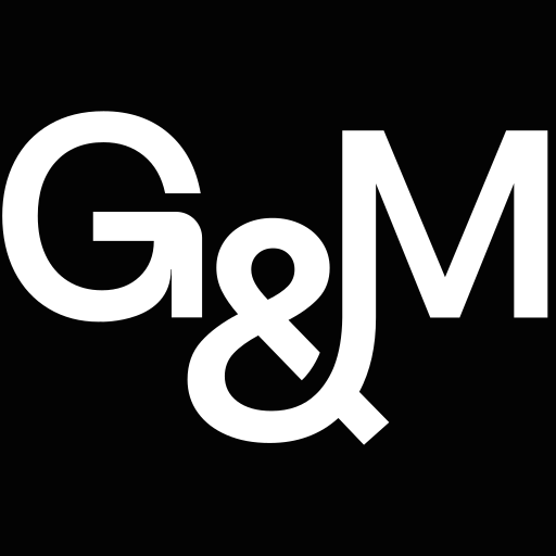
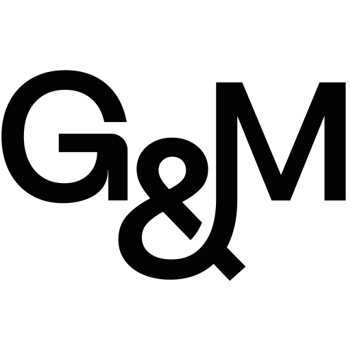
Every logo is black or white, chosen by its background. Use the black file on white, gm-light-tan or gm-tan, and the white file on gm-black or gm-ide-green. Only the favicon has a color of its own. The one exception is the header of a case study page on grainandmortar.com, which takes that project's text color: don't copy it anywhere else.
Primary Wordmark
Grain & Mortar®: modern sans, tight lockup, stylized ampersand, registered mark. This is the logo, and the default choice for anything static.


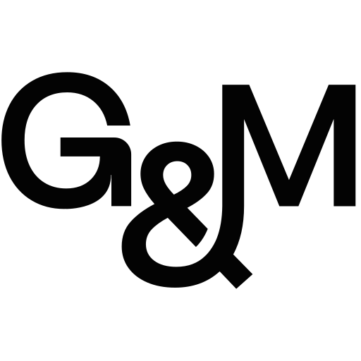
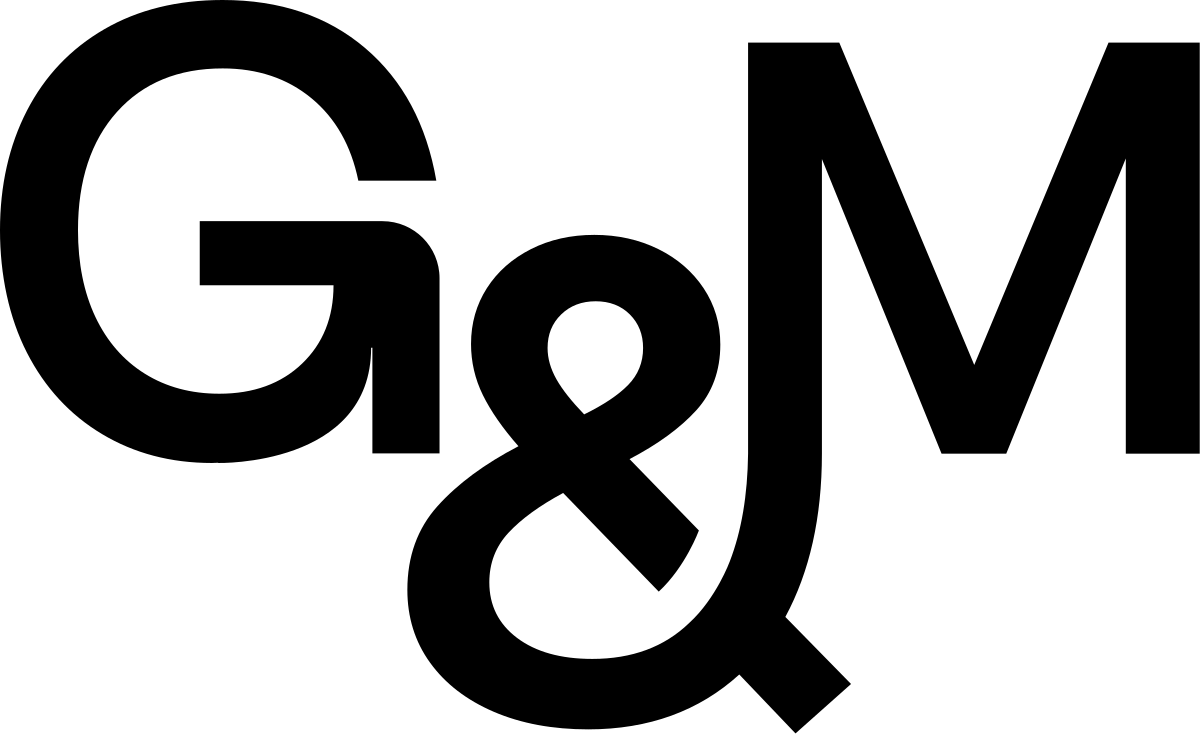
G&M Monogram
The condensed G&M lettermark with the integrated ampersand. Use it where the full wordmark won't fit: avatars, app icons, footers, tight headers, mobile.

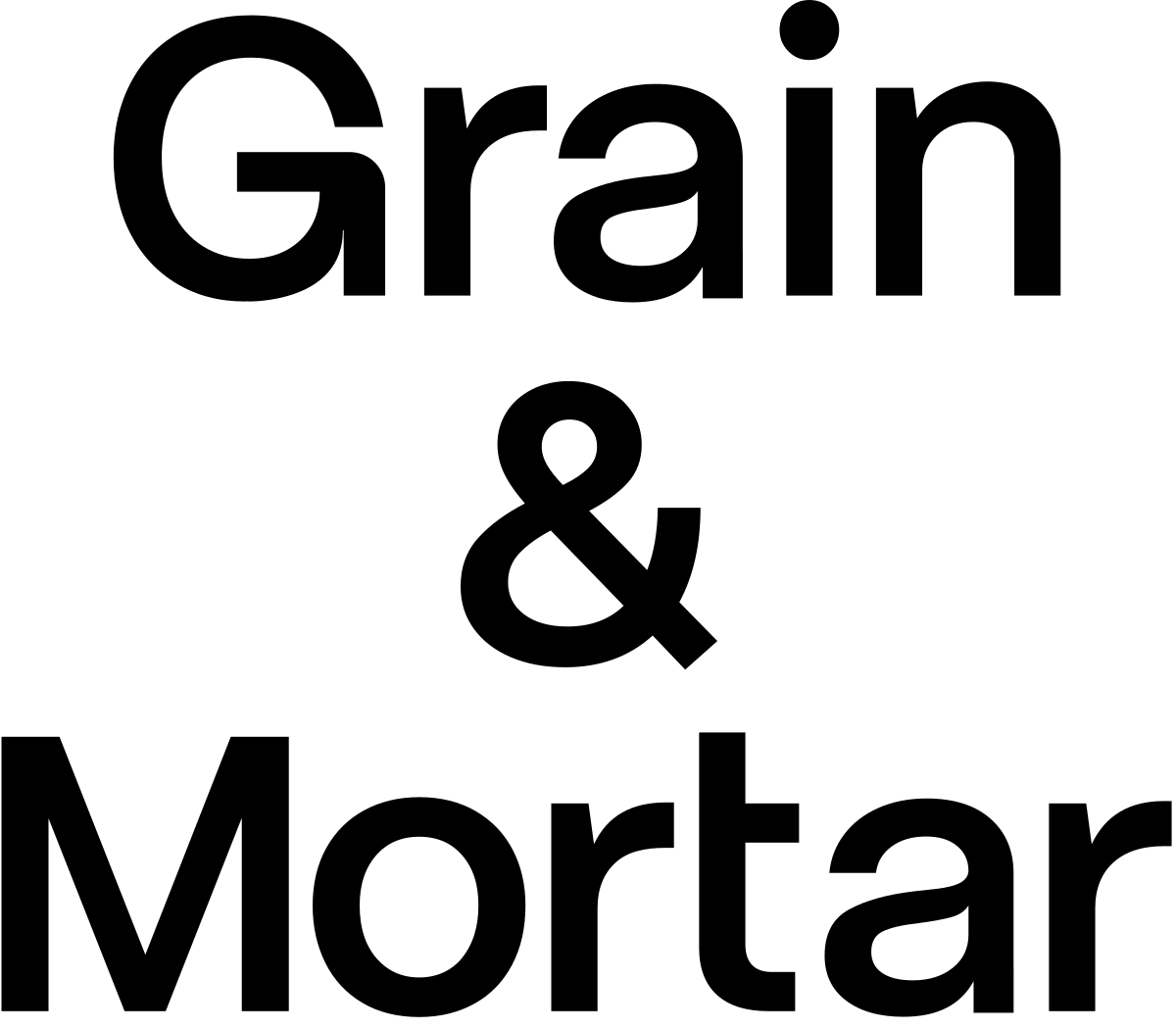
Stacked Lockup
Grain, ampersand and Mortar on three lines, for square or tall spaces.

Ampersand
The standalone G&M ampersand, as a decorative accent. It doesn't replace the monogram as an app mark.


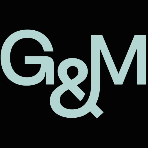
Favicon
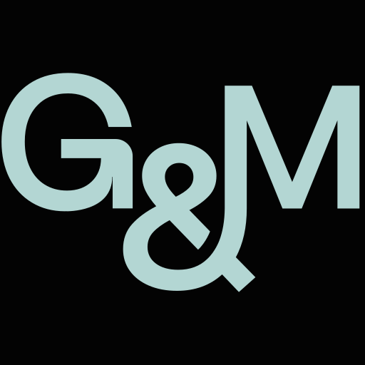
Canonical: a black #030303 square tile with the monogram in gm-sky #B3D6D3, which is what grainandmortar.com ships. This is the one place the mark appears in a color. The black-and-white versions are for surfaces that are strictly black and white, or tab chrome where a white tile carries better.






Clear space
Not defined yet. Mike to set it. Until then, keep other elements well away from the logo and don't state a measurement as if it were a rule.
Minimum size
Not defined yet. Mike to set it. For reference, the site's header runs the wordmark at 20px tall at 640px wide and under, and 16px tall at 400px and under. Where the wordmark gets too small to read, use the monogram.
Misuse
- Don't tint the logo: no chartreuse, no brand color, no gradient. Black or white only, apart from the case study header above.
- Don't set the logo as text, redraw it or edit its SVG. Place the file.
- Don't stretch, rotate or outline it, or add a shadow.
- Don't use the retired stencil wordmark.
- Don't scale the wordmark down into a favicon. Use a favicon file.
- Don't use the ampersand as an app mark. Use the monogram.
- Don't build a static logo from the three pieces behind the site's animated header (Grain, ampersand, Mortar). Those exist for the hover animation and aren't offered here.
The wide-tracked stencil wordmark, G R A I N & M O R T A R, is the old brand. If you find it in a project, including as grain-mortar-logo-black.svg or grain-mortar-logo-white.svg, it's out of date: replace it with the primary wordmark. It isn't offered here.
The files are the live site's. The usage wording is drafted from how the site uses them, for Mike to approve.